Patches vs Prints for Stronger Web3 Streetwear
A hoodie can carry a PFP, but the finish decides whether it feels like fan merch or a piece people reach for every week. In the patches vs prints conversation, the right answer comes down to what your community is wearing, what the artwork demands, and what kind of signal the piece should send offline.
For Web3 brands, merch is not a logo placement exercise. It is physical proof of membership. A well-made patch can feel like a club insignia earned through conviction. A sharp print can turn full digital-art energy into a wearable canvas. Both have a place. The move is knowing which one deserves the drop.
Patches vs Prints: The Fast Answer
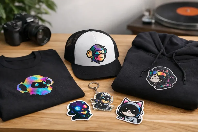
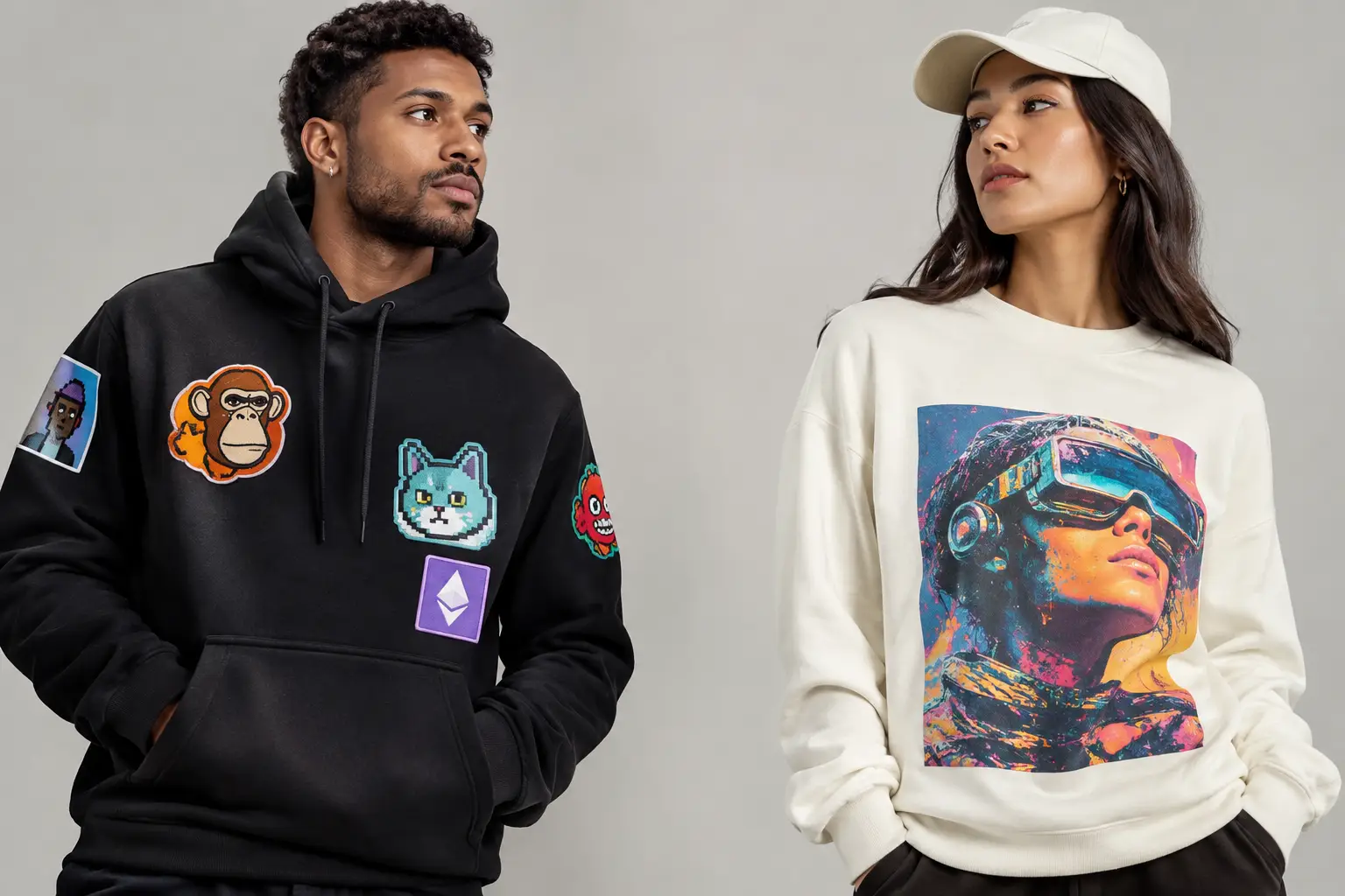
Choose patches when you want dimension, tactile detail, and an elevated streetwear feel. They work especially well for logos, emblems, mascots, short text, and symbols that need to read clearly from across the room. Think caps, heavyweight hoodies, varsity-style jackets, bags, and utility pieces.
Choose prints when the artwork is detailed, colorful, photographic, or built around a full illustration. Prints give digital artists more room to preserve linework, gradients, textures, and expressive character art. They are the natural choice for graphic tees, poster-style back prints, statement sweatshirts, and collection artwork with a lot going on.
Neither finish is automatically more premium. A small, low-detail print can feel underpowered. A bulky patch on lightweight fabric can feel forced. The product, the art, and the culture behind the drop have to align.
Why Patches Carry Streetwear Weight
Patches make merch feel constructed rather than simply decorated. The raised surface catches light, adds texture, and gives a garment a more intentional silhouette. On a black cap or washed hoodie, a clean embroidered or woven patch can deliver that quiet flex effect: recognizable to the people who know, intriguing to everyone else.
For NFT communities, that matters. A patch can operate like a physical badge of affiliation. Your holder group, artist collective, or project icon moves from a wallet and profile picture into real-world rotation. It says, “I was here,” without needing to explain the entire lore.
The best artwork for patches
Patches are strongest when the design is simple enough to stay legible in thread or woven detail. Bold icons, clean outlines, block lettering, monograms, shields, and compact character faces usually translate well. A patch is also ideal for designs meant to feel collectible, like a numbered drop insignia or a recurring collection mark.
Embroidery brings visible thread and dimension, making it a great fit for classic streetwear branding. Woven patches can capture finer lines and smaller type with a flatter finish. Other patch styles, such as PVC or chenille, create different moods, but they need to fit the garment and the community aesthetic rather than exist as a novelty.
The limitation is detail. Tiny type, intricate backgrounds, soft gradients, and complex digital paintings can lose their impact when reduced to a small patch. If the art needs ten colors and a hundred subtle decisions to work, let it breathe as a print.
The trade-off: feel, placement, and cost
Patches can add perceived value, but they can also add bulk. On a heavyweight hoodie or structured cap, that is part of the appeal. On a thin tee, it may pull at the fabric or make the garment less comfortable. Placement matters too. A chest patch, sleeve badge, or bag detail often looks intentional. A large patch covering the center of a shirt can start to feel costume-like unless the concept is built around it.
They can also be more complex to produce than a straightforward print, particularly when each piece needs a separate patch application. For a focused, logo-led drop, that extra effort may be exactly what makes it feel exclusive. For accessible community basics, print can be the smarter lane.
When Prints Win the Drop
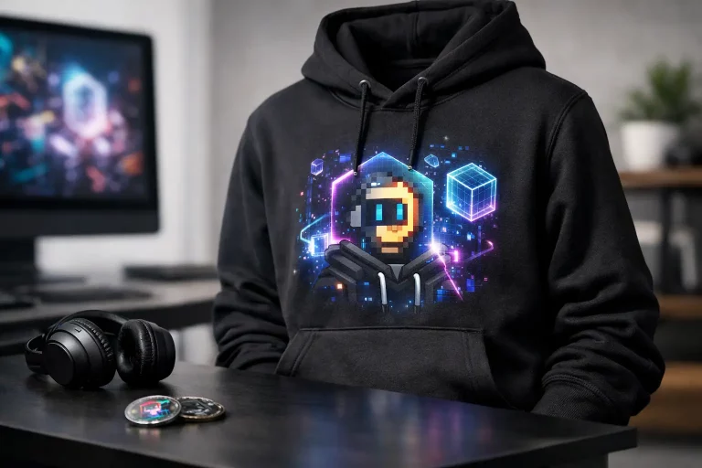
Print is not the “basic” choice. When the art is strong, a print is the main event. It gives a digital artist room to preserve what made the original piece hit: saturated color, loose texture, strange details, layered worlds, and the personality of a character that cannot be reduced to an emblem.
A full-back graphic can turn a hoodie into a conversation starter. A clean front hit paired with a large illustrated print on the back creates the familiar streetwear formula collectors actually wear. Prints also give creators space to build visual storytelling into apparel, not just stamp branding onto it.
Digital art needs room to breathe
If your community has a distinctive visual universe, print is likely the better medium. Detailed PFP traits, generative-art patterns, surreal landscapes, comic-style scenes, and expressive typography are built for larger print areas. The best pieces retain the DNA of the on-chain work while being composed specifically for fabric.
That last part is key. Do not just export a square NFT image and place it in the middle of a tee. Adapt it. Crop with intent. Build a frame, add a supporting graphic, or use typography that gives the design a streetwear context. Wearable art should feel designed for the body, not copied from a marketplace thumbnail.
Durability depends on the method and the care
People often ask whether patches last longer than prints. The honest answer: it depends. A properly applied, high-quality print can hold up extremely well when washed with care. A patch can outlast the garment around it, but thread can snag and edges can lift if it is poorly applied or heavily abused.
For either format, encourage the basics: wash inside out, use cold water, avoid harsh heat, and skip aggressive ironing directly over the decorated area. Good merch is made to be worn, not stored forever, but care protects color, shape, and finish.
Match the Finish to the Product
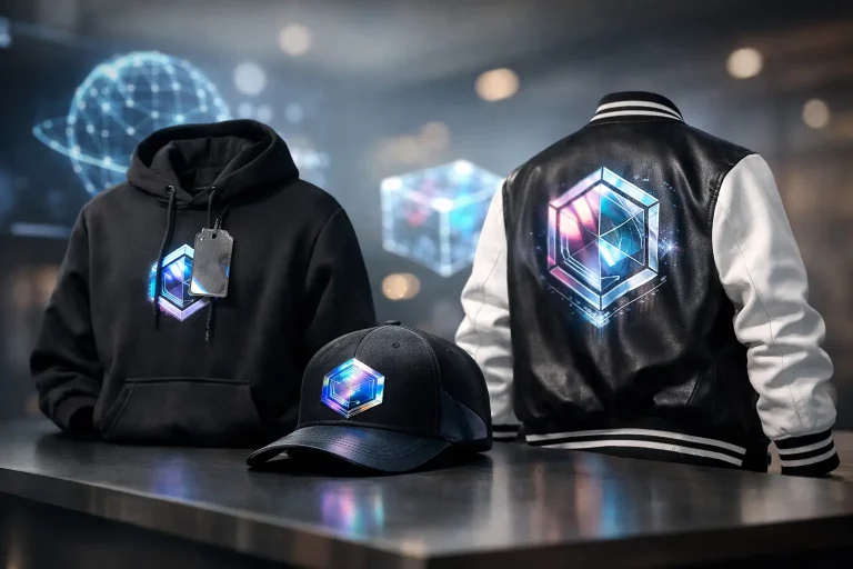
The garment should lead the decision. A heavyweight hoodie can support a chest patch, sleeve embroidery, or an oversized back print. A cap wants a patch or embroidery because the structure gives that detail presence. A tote bag can carry either, depending on whether the goal is understated utility or bold visual art.
T-shirts are where prints usually dominate. They are lightweight, easy to layer, and perfect for artwork that needs scale. A small patch can work on a premium tee, but it needs to feel deliberate and proportionate. If the patch is there only because it sounds elevated, the piece will not earn repeat wear.
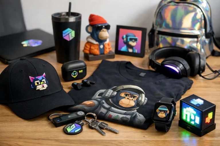
For a stronger collection, mix finishes across the range. Use a patch on the cap or bag as the recognizable team marker. Put the campaign artwork on the tee or hoodie as the statement piece. That creates hierarchy without repeating the same logo on every item.
Think Like a Collector, Not a Catalog
Web3 audiences know the difference between a generic logo garment and an artifact from a real culture. The question is not only “patch or print?” It is “what will this item mean six months from now?”
A patch may become the recurring marker that ties multiple drops together, much like a recognizable label detail. A print may capture a specific era, artist collaboration, mint milestone, or community moment. One builds continuity. The other can document a chapter.
That is why limited drops work best when each finish has a role. Reserve patches for core symbols and foundational identity. Let prints carry the bigger visual swings, seasonal concepts, and creator-led artwork. The result feels curated instead of overproduced.
At NFT Merch, the strongest pieces bridge digital ownership and real-world style without flattening either one. They let a community member wear the culture with confidence, whether they are at a meetup, on a video call, or nowhere near a crypto conversation.
The Better Choice Is the One People Will Wear
If your mark needs to feel like an insignia, build it as a patch. If your art needs attention, color, and space, print it big enough to matter. And when the collection has a real point of view, use both – not as competing techniques, but as different ways to make digital identity tangible.
Make the piece worth claiming before you decide how to decorate it. The right finish will follow.