Crypto Apparel Quality That Holds Up Off-Chain
A wallet full of NFTs may live on-chain, but crypto apparel quality gets judged the second someone feels the fabric, checks the collar, or sees how the graphic sits after a wash. That is the real-world test. A clean mint is exciting. A cracked print or limp hoodie is not.
For Web3 communities, apparel is more than a logo delivery system. It is a physical signal of taste, membership, and belief in a project’s culture. The best pieces carry the same energy as the art and community behind them: considered, distinct, and built to stay in rotation. The weak stuff feels like a rushed cash grab before the first wash cycle is done.
What Crypto Apparel Quality Really Means
Quality is not one thing. It is the combination of the garment itself, the way artwork is translated onto it, the accuracy of the fit, and the care taken in fulfillment. A loud graphic cannot rescue a thin shirt with a twisted seam. A heavyweight blank cannot rescue art that looks muddy, off-center, or plasticky.
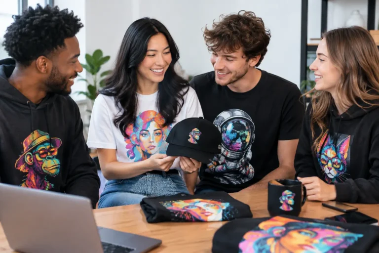
Streetwear-minded buyers usually notice the blank first, even if they do not name it that way. They notice whether a tee drapes well, whether a hoodie has enough structure at the hood and cuffs, and whether the fabric feels intentional rather than disposable. Then comes the visual hit: sharp linework, rich color, readable details, and placement that makes the design feel like part of the garment.
For NFT merch, there is one more layer. The design needs to respect the source material. A recognizable character, trait, or collection mark should not be stretched, blurred, or stripped of its personality just to fit a print area. Digital identity deserves a better translation than clip-art treatment.
Start With the Blank, Not the Graphic
A premium print starts with a garment that can support it. Fabric weight, composition, construction, and cut all shape how a piece wears over time.
A lighter cotton tee can make sense for hot weather, layering, or an easy everyday fit. It is not automatically low quality. But it should still have a stable neckline, a smooth surface for printing, and fabric that does not go sheer after a few wears. Heavier-weight tees bring more structure and a more elevated streetwear feel, especially when the design is bold or oversized.
Hoodies and sweatshirts deserve even more scrutiny. Look for a substantial hand feel, ribbing that recovers after stretching, and a hood that holds its shape. A soft fleece interior feels great, but softness alone is not the point. If the cuffs bag out, the body pills quickly, or the seams pull, the initial comfort does not last.
Fit is part of the product, too. A standard fit is easy to wear and gift. An oversized silhouette can land harder for streetwear, but only when it is deliberately proportioned. Randomly sizing up a basic hoodie is not the same as designing an oversized piece. Shoulders, sleeve length, body width, and hem all need to work together.
Print Quality Is Where the Art Wins or Loses
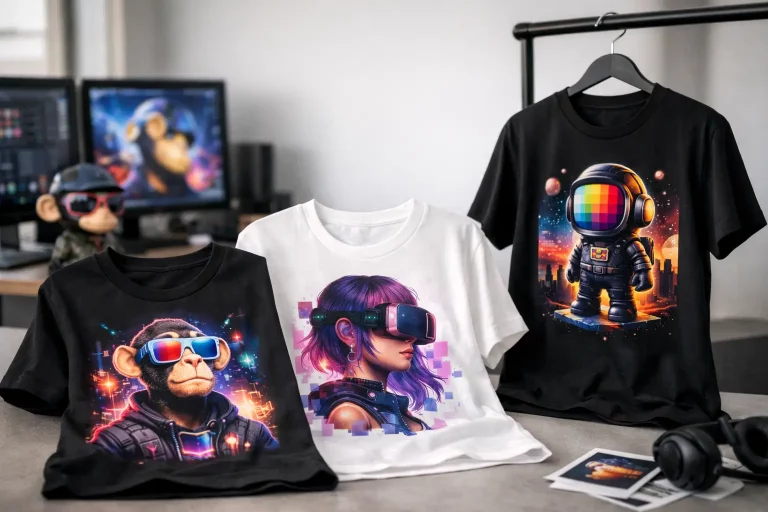
Web3 art often has bright gradients, fine details, textured backgrounds, and instantly recognizable faces. That makes print execution non-negotiable. The goal is not simply to get an image onto fabric. The goal is to retain the energy of the original artwork in a wearable format.
The right print method depends on the design and garment. Direct-to-garment printing can handle full-color artwork and detailed illustrations well, particularly on cotton-rich garments. Screen printing can create a classic, durable finish for simpler graphics and larger runs. Embroidery brings texture and dimension to caps, patches, and select apparel, though it is better suited to bolder, less intricate artwork.
There are trade-offs. A highly detailed full-color design may need a print process that leaves a slightly more noticeable finish than a simple one-color graphic. An embroidered logo can look premium but may not capture a complex NFT trait set. Quality means choosing the process that serves the art rather than forcing every design through the same production shortcut.
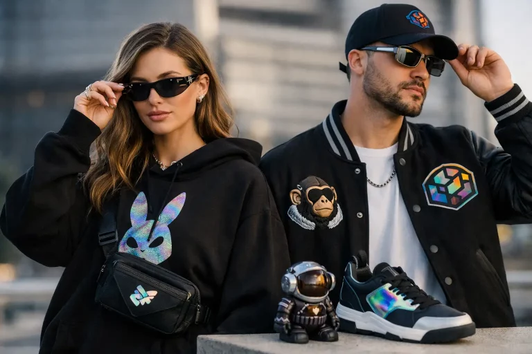
Placement matters as much as technique. Center chest, left chest, back print, sleeve hit, and oversized front graphics all create different statements. A centered design that is a few inches too low can make a premium shirt look amateur. A back graphic should follow the garment’s shape instead of fighting it. The details are small. The difference is obvious.
How to Spot a Better Print
You do not need a factory tour to make a smart call. Check product imagery for crisp edges, intentional color contrast, and designs that look integrated with the fabric. Avoid graphics that appear blurry, overly glossy, or surrounded by an obvious rectangular print boundary when the artwork should blend naturally.
After purchase, wash care reveals the truth. Turn printed apparel inside out, use cold water, and avoid aggressive heat when possible. Good care protects any garment, but quality printing should still hold its color and clarity without peeling, flaking, or losing major detail under normal wear.
On-Demand Production Has a Different Standard
On-demand merch is built after an order is placed. That means no giant pile of speculative inventory, no unnecessary overproduction, and no minimum order barrier for the community member who wants one piece, not a carton. For Web3 culture, that flexibility matters. Communities move quickly, collaborations are specific, and personal expression should not require buying in bulk.
The trade-off is that on-demand production needs strong quality controls. Because each piece is produced individually, consistency in garment sourcing, artwork preparation, print calibration, and fulfillment matters more than ever. A brand cannot hide behind warehouse volume. Every order has to earn its place in someone’s closet.
There can also be slight variation between production batches or garment colors. That is normal across apparel manufacturing. What should remain consistent is the core promise: a wearable piece that looks intentional, feels good, and accurately represents the collection or creator it came from.
Why Official Culture Beats Generic Crypto Merch
Not all crypto apparel carries the same weight. A generic Bitcoin joke tee might be fine for a quick laugh, but it does not create the same connection as official merch rooted in a real project, artist, or community. Authenticity changes the equation.
When the source is recognized, the clothing becomes a signal to people who get it. A GRINNZ graphic, a creator collaboration, or a community-specific visual language says more than “I know crypto.” It says, “I am part of this corner of the culture.” That is why artwork accuracy, licensing, and design intent matter. The apparel should preserve the identity people chose to collect in the first place.
NFT Merch treats that bridge from digital ownership to physical style as the whole point. The piece has to work on the street, at an event, on a video call, or in a collector’s rotation. It cannot rely on token-gated hype alone.
A Better Buying Checklist for Web3 Streetwear
Before you check out, look past the mockup. Read the garment details, consider the intended fit, and choose sizing based on actual measurements when available. Think about how often you will wear the piece, not only how strong it looks in a drop announcement.
Ask whether the design has room to breathe. Is it connected to a brand, artist, or community you genuinely want to represent? Does the colorway work with the clothes you already wear? Is the artwork clear enough to hold up beyond a screen-sized image?
The best crypto merch earns repeat wear because it balances cultural relevance with real garment standards. It feels like a collectible, but it never has to stay in the closet like one.
Wear the project. Rep the art. But expect the garment to do its part, too. When the digital culture is built to last, the physical piece should be ready for the same long hold.